American Family Insurance

Agent Website & Dashboard

Background


Client: American Family Insurance

My Role: UX, visual design, research

Viewport: Desktop, tablet, phone, employee and customer-facing tool

Design Tool: Figma, Photoshop, Illustrator


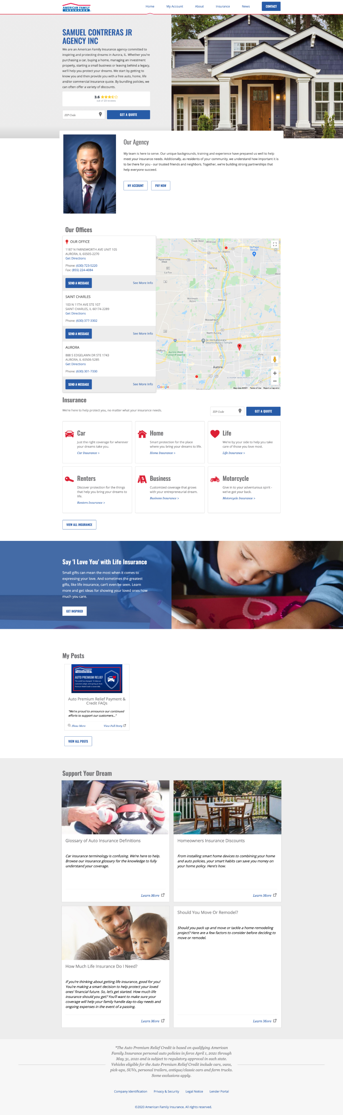
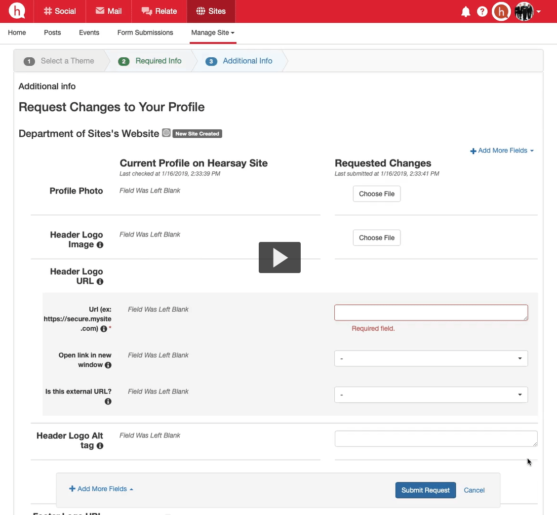
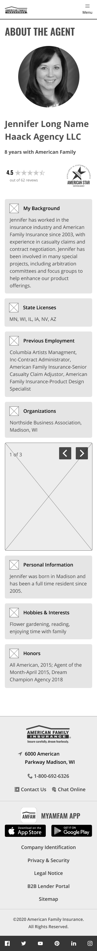
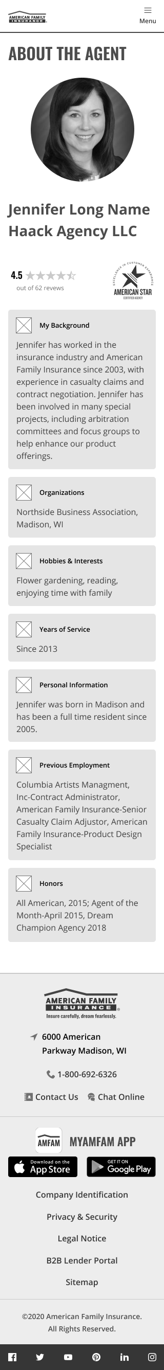
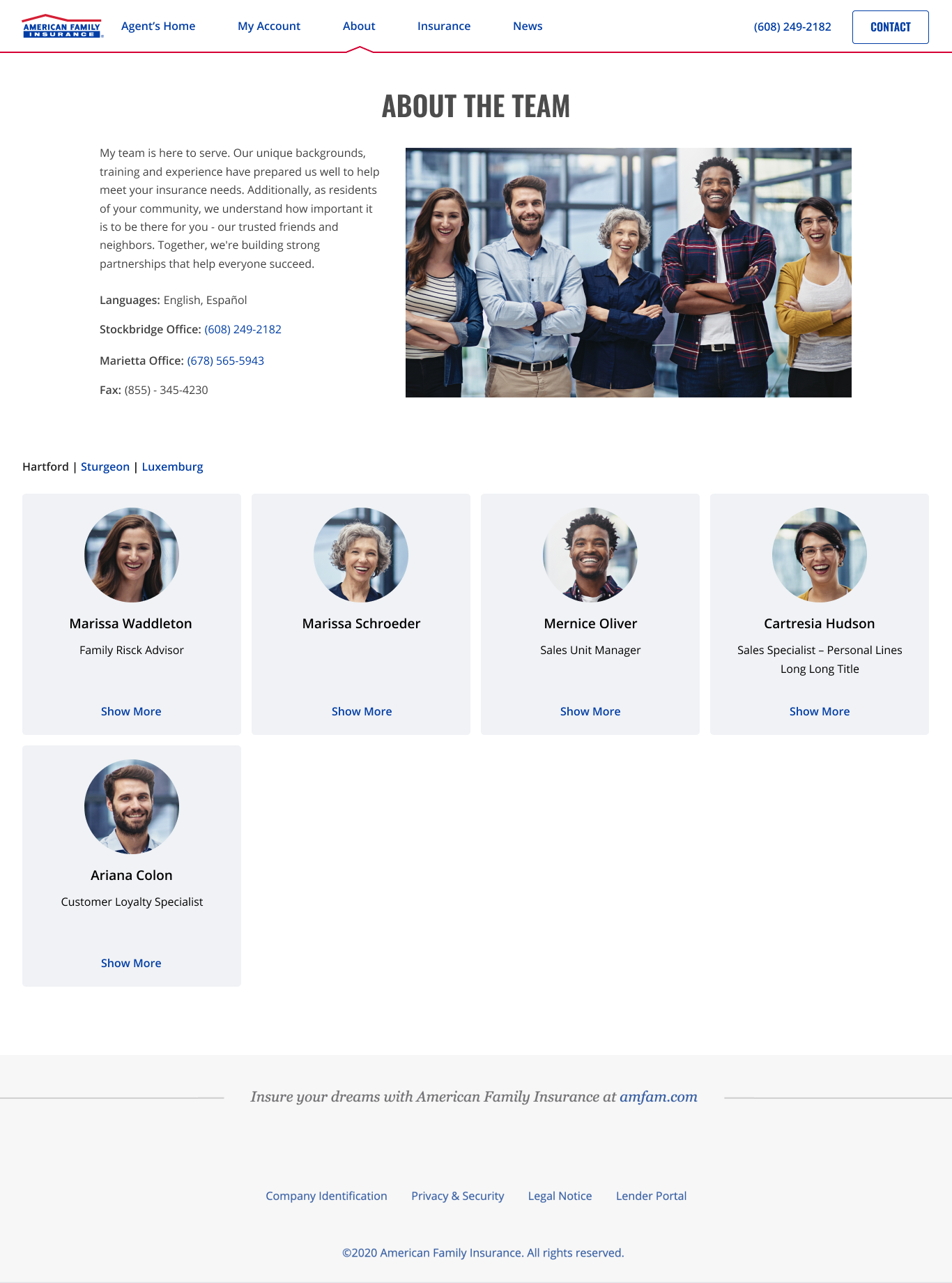
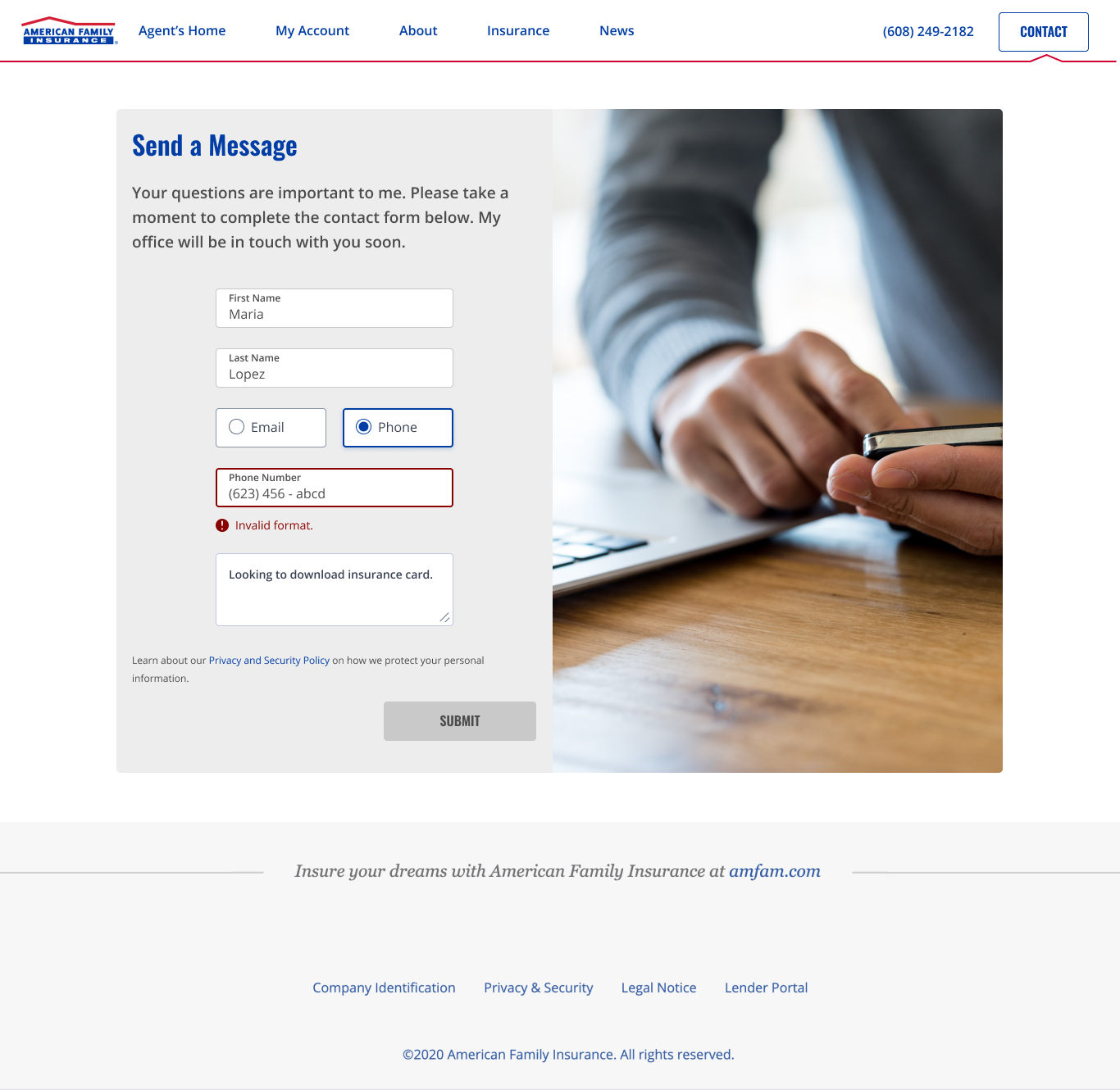
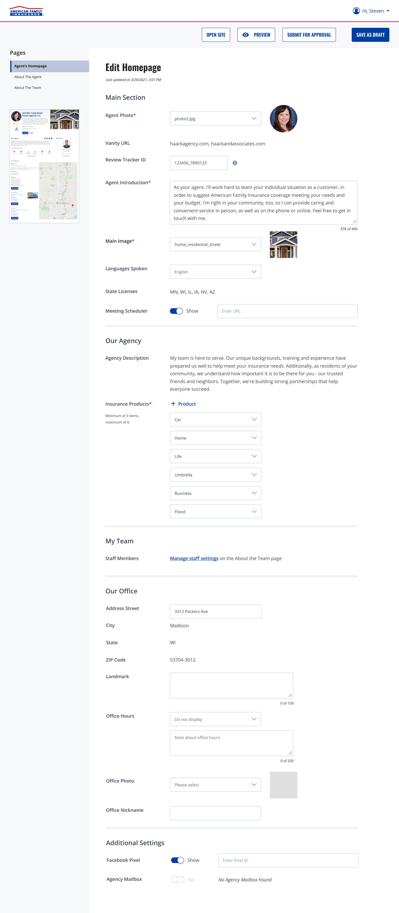
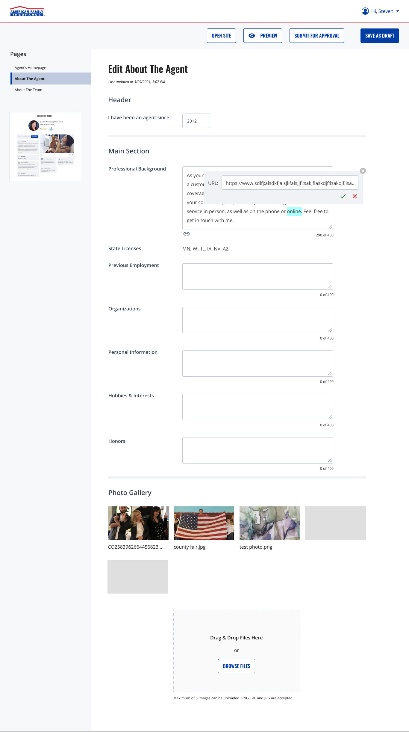
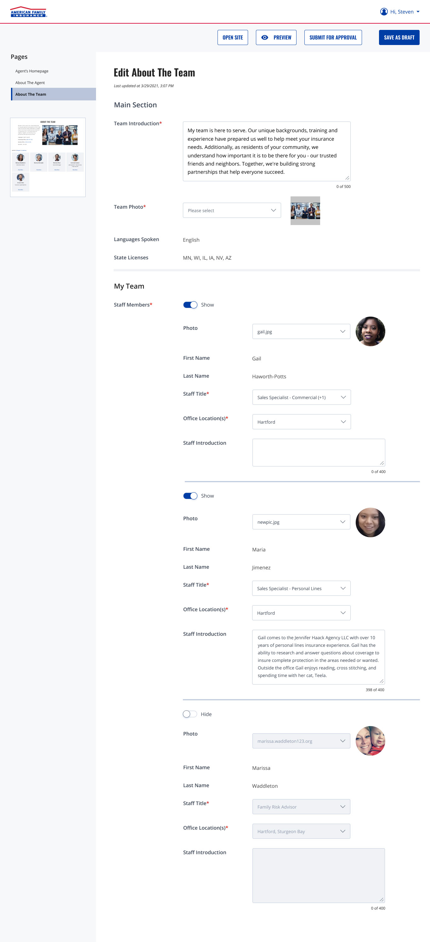
American Family Insurance (AmFam) agents are independent operators of the brand and are responsible for their own websites including marketing and management. They use a content management system (CMS) called Hearsay System to maintain these sites. However, AmFam is planning to migrate all agent websites and its CMS from Hearsay to Sitecore, where the tech stack for most the company's products live.

Opportunity


Agents came into this project already not happy with the level of support they receive from AmFam as they were told more than a year ago that improvements were coming. They also complained that the CMS was not user friendly, didn't allow for customization needed to standout amongst competitors nor help generate new leads. AmFam used the migration opportunity to improve user experience of agents' websites and the CMS; and to drive conversions.

Left, is the old homepage of an agent website. Right, is the old management system called Hearsay.

Solution


I created a site management tool that was user friendly for agents to make updates; scalable to allow for growth in user needs, flexible enough to prioritize content and customizable so the sites look consistent with the AmFam brand but representative of the agent offices. In addition, I created a "bridge design" meaning it's not too far different from what user are used to while getting us closer to new iteration. I removed unused content blocks, improved the layout and the laid the foundation for upcoming widgets to be added.

Process


We conducted research on multiple fronts:


  • The product owner and myself met remotely with a pilot group, made up of more than 20 agents, where I documented their complaints, needs and wish list.
  • I requested our analyst to pull key metrics on all agent websites including unique visitors, bounce rate, average page load times, average time on sit, quote starts and completes. We also took a look at page flow to learn how visitors reached their page, where did they go while there and where did they land when exiting. The data showed that most users are there to make a payment and to get a quote, respectively. 
  • I collaborated with a third-party agency who conducted a UX audit of competitor's agent sites, assessed aspects of the design such as navigation, branding, conversion tactics, features and localization.
  • I partnered with a teammate, a UX Researcher to understand what prospects and potential customers want to see on their website. Also, we identified features or information to display on their website. Lastly, we identified potential customization elements for the website templates. The sessions were remote and unmoderated and took up to 11 minutes to complete by six participants.

Recommendations included giving agents different ways to determine how personable they want to be by sharing personal and professional information about themselves and their staff. Give agents ability to be responsive to prospects and customer needs such as email, chat, message, online appointments, text, phone vs in-person and etc. Give agents ability to show how agents relate to their community and why. 

Recommendations included navigation and structure efforts around prioritizing critical actions for core audiences, adding Spanish translation and eliminating distractions. As for visual and localization, make better use of hero space, incorporate accordions to improve scanning and ensure agents understand benefits of updating information per content block. Finally conversion, consider adding anchor links that take users back to the contact form. Emphasize availability and convenience for users.

Now that the discover phase was completed, it was time to ideate. I worked closely with the product owner, business analyst and dev leads to set a desired date, prioritize the backlog for later iterations, highlight technical feasibility and align overall expectations. Since the UX team took a mobile-first approach to designing, solution shaping began with creating wireframes for phone, tablet and desktop.

I created a high fidelity prototype to validate with participants aged 26 to 42 years who were recruited from the UserTesting panel. Based on their feedback and prior research, I finalized the design, presented it for stakeholder approval and annotated mockups with user interaction instructions.

Result


The MVP was delivered first with two future iterations with additional features were scheduled for later dates. Sixty-five percent of the pilot group saw an increase in engagement post the redesign. My satisfaction from this project came when several agents, who appeared frustrated when we first met, told the product owner that they enjoyed working with me because I listened and delivered.