InContext Solutions
Shopper Tutorial
Background
Client: InContext Solutions
My Role: UX, visual design and research
Viewport: Desktop, tablet and phone
Design Tool: XD, Illustrator, Photoshop
InContext Solutions used virtual shopper, research methods to save retail clients time and money with insights into how their customers behave at the shelf and why. These methods included AI, virtual store setup, study design, analysis and shopper testing. To ensure participants have a successful test they must complete a tutorial first.
Opportunity
The Business Analyst, among other stakeholders, saw weaker than expected data in the shopper testing results. This was mainly due to respondonents abandoning the shopping exercise, lengthy completion times, drops in frame rates per second and negative feedback left in surveys. In addition, leadership wanted to expand shopper testing beyone desktop to mobile devices. The challenge here was to quickly learn the product as a new employee and learn from their prior improvement efforts as I prepared for future ones.
Solution
I proposed to leadership that I conduct user testing with our clients to learn first-hand of their issues, concerns, workarounds and nice-to-have ideas. Before I made any design recommendations I wanted to establish a foundation of data to base my decisions. Thereafter, I planned to take these learnings to produce mockups for desktop, tablet and phone. Test, iterate on the design and repeat.
Research Process
Prior to me joining the company, developers made decisions based solely on client feedback. When a newly released feature was deemed unusable, it was simply decommissioned. Very inefficient use of company resources. Unfortunately, there wasn't any historical data for me to leverage nor was I allowed access to our external clients. So I decided to perform some guerrilla research with friends and family of internal employees.
- Created participant profile that captured age, gender, race/ethnicity, location, education, tech skills and device type to be used during testing
- Created test plan that included participant instructions, eight tasks and 10 survey questions
- Recruited 15 survey participants where I moderated tests on Zoom and Teams over nine days
- Conduct usability tests on the old, existing experience
General Testing Objectives
Observe users shop a 3D store
Understand intuitiveness of the design
Understand users' ability to navigate and find a product(s)
Identify if users find features useful
Recording of a participant experiencing the old shopping tutorial.
Once the test sessions were completed, I conducted an analysis on all assigned tasks to document which tools users preferred for navigation and selection as well as capturing any errors. These data points will contribute to where improvements to the UI and 3D environment should be made.

I administered a 10-item questionnaire to participants to measure their experience within the 3D environment. The shopper tutorial received a System Usability Scale (SUS) score below 68, meaning there was a lot of room for improvement.
Findings
Consider replacing joystick with navigation controls
Overall experience was slow and laggy
Legibility of wallpaper can cause confusion
Reduce number of steps and remove friction
Paricipants attempt to shop any item, chips and cereal most common
60 percent of participants tried to add second item to cart
Participants initially overlook instructional banners and help bubbles until they run into a problem
Recommendations
Better identify where users are to shop
Write clearer instructional messages and make them more visible
Improve users' ability to pick up products
Improve layout, functionality and button labels in product viewer
Move users quicker from "adding a product to cart" to "view cart"
Replace store with lighter environment to improve computer performance
Improve wallpaper resolution
Design Process
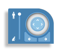
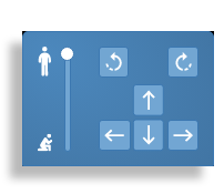
Now that I established some qual and quan data, I was ready to design! I started with the old joystick as a priority. Users were over-rotating which made it difficult to navigate the store and to select products. Also, users couldn't easily differientiate the functionality in the left/right arrows from the multi-directional arrows. To solve, I created a new controller that gave more explicit directions for independent functionality. The additional recommendations I found through research can be seen applied in the video below. Take a look and let's discuss.

Old joystick.

New controller.
Results
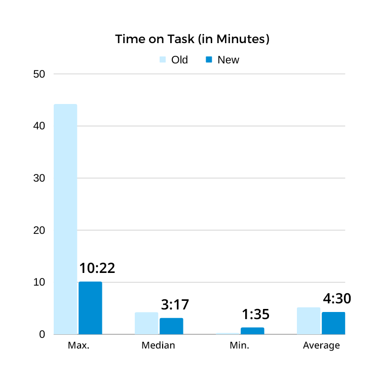
Nearly six months after the release, we discovered our time, effort and improvements were successful. We watched the maximum time spent on the tutorial drop more than 4 times, we saved users nearly a full minute on average and there were no incompletes with the fastest tutorial completed in one minute and thirty-five seconds.
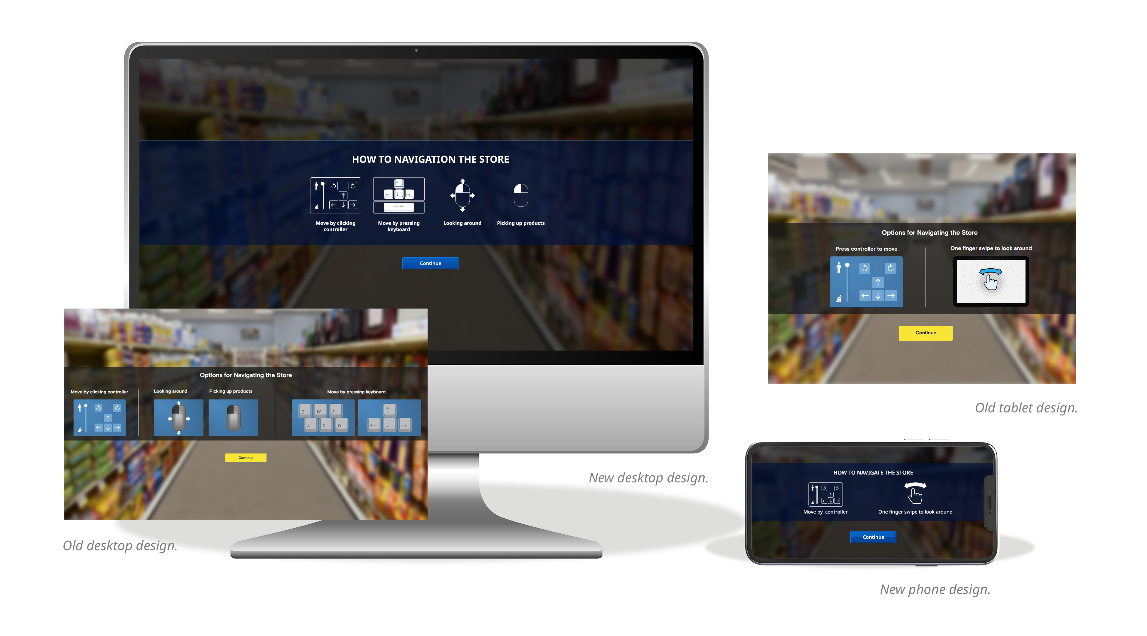
Since our improvements were successful, we continued to iterate on the design and expanded the tutorial experience to tablets and phones.

