CareerBuilder
Candidate Portal
Background
Client: CareerBuilder
My Role: UX, visual design, research
Viewport: Desktop, mobile responsive
Design Tool: Axure, Sketch, Photoshop
One of CareerBuilder's most profitable products was its employment screening platform where candidates completed a series of forms for companies to perform background checks on them prior to being hired.
Opportunity
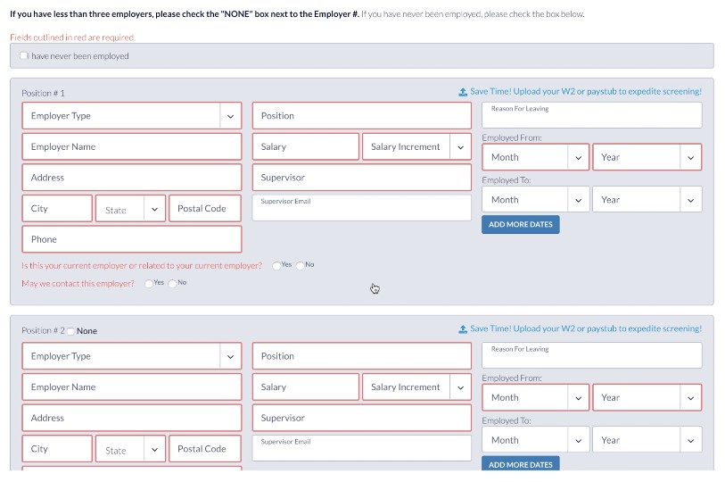
CareeBuilder's employment screening call center saw an increase in the number of candidates having issues completing their background forms without assistance from a representative. In addition, employers complained that the turnaround time from background check to hire was too lengthy. The challenge was updating a UI that would be built on a legacy system. Poor usability introduced many errors, which delayed the screening process as well as clients' ability to hire competitively.
Solution
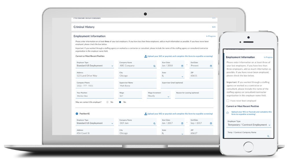
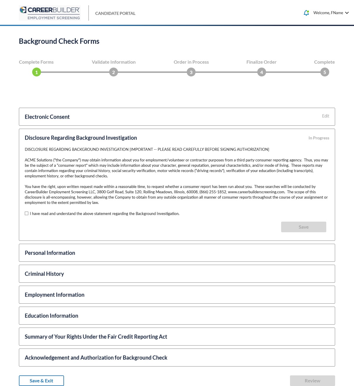
We decided to redesign the screening forms, updated the design standards to match other CareerBuilder products and implemented new features, which resulted in my first two patents! In addition, we took this opportunity to expand on the flow of forms by providing candidates with a full experience where they could manage supporting files, track tasks and communicate with the call center. I was given three weeks to create wireframes, test prototype and design pixel perfect comps.
Process
The VP and co-founder of the employment screening division, brought to my attention that over the years he collected verbatims from candidates who had plenty to say about the background check forms in the old experience. I started my research efforts there by combing through a thick binder of user feedback. I took those learnings and spent seven days, including weekends, to create wireframes of progressive forms with conditional inputs as to not overwhelm users with too much content in a single view. However, the expectations were set as to how many forms needed completing.
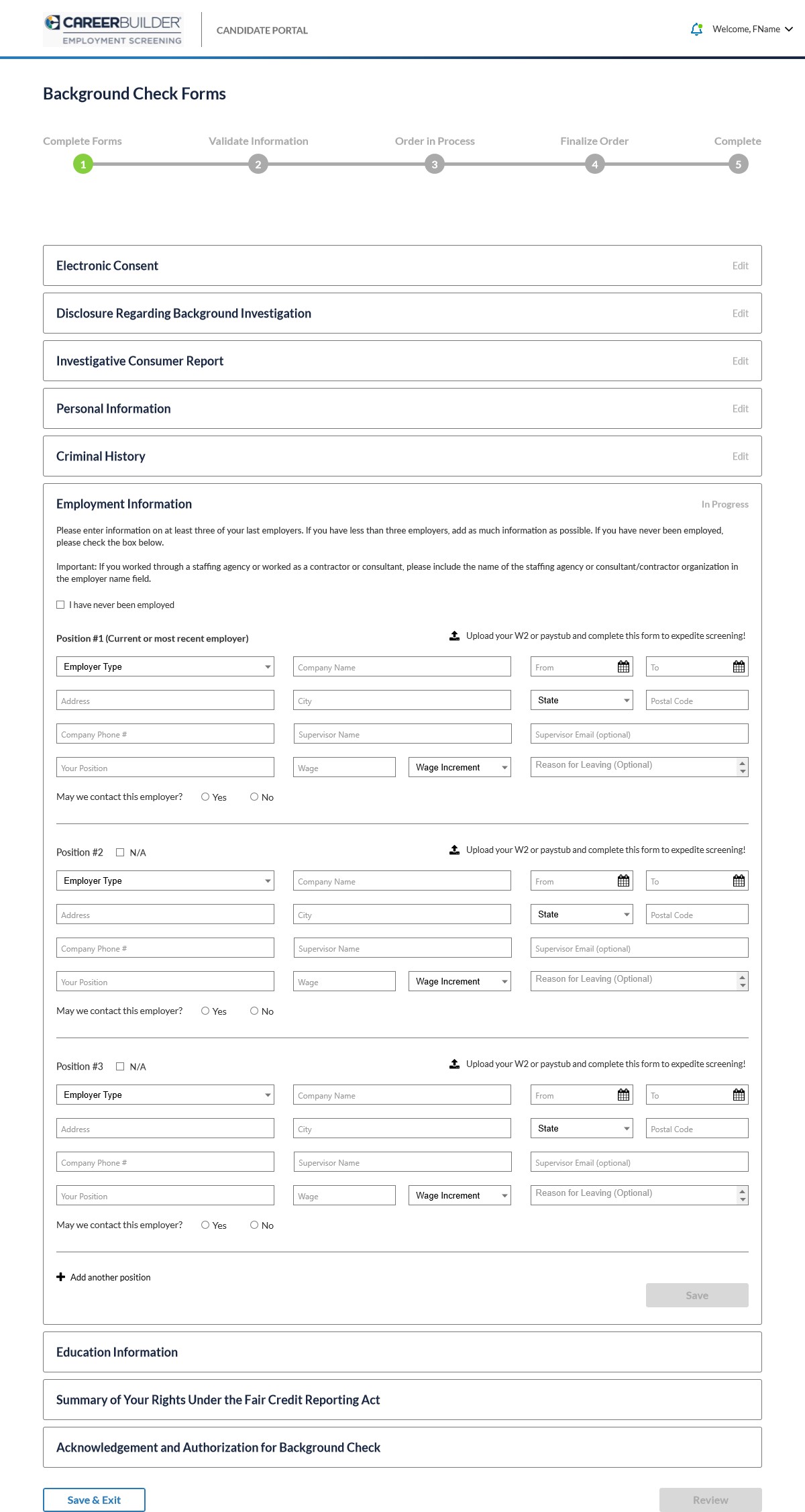
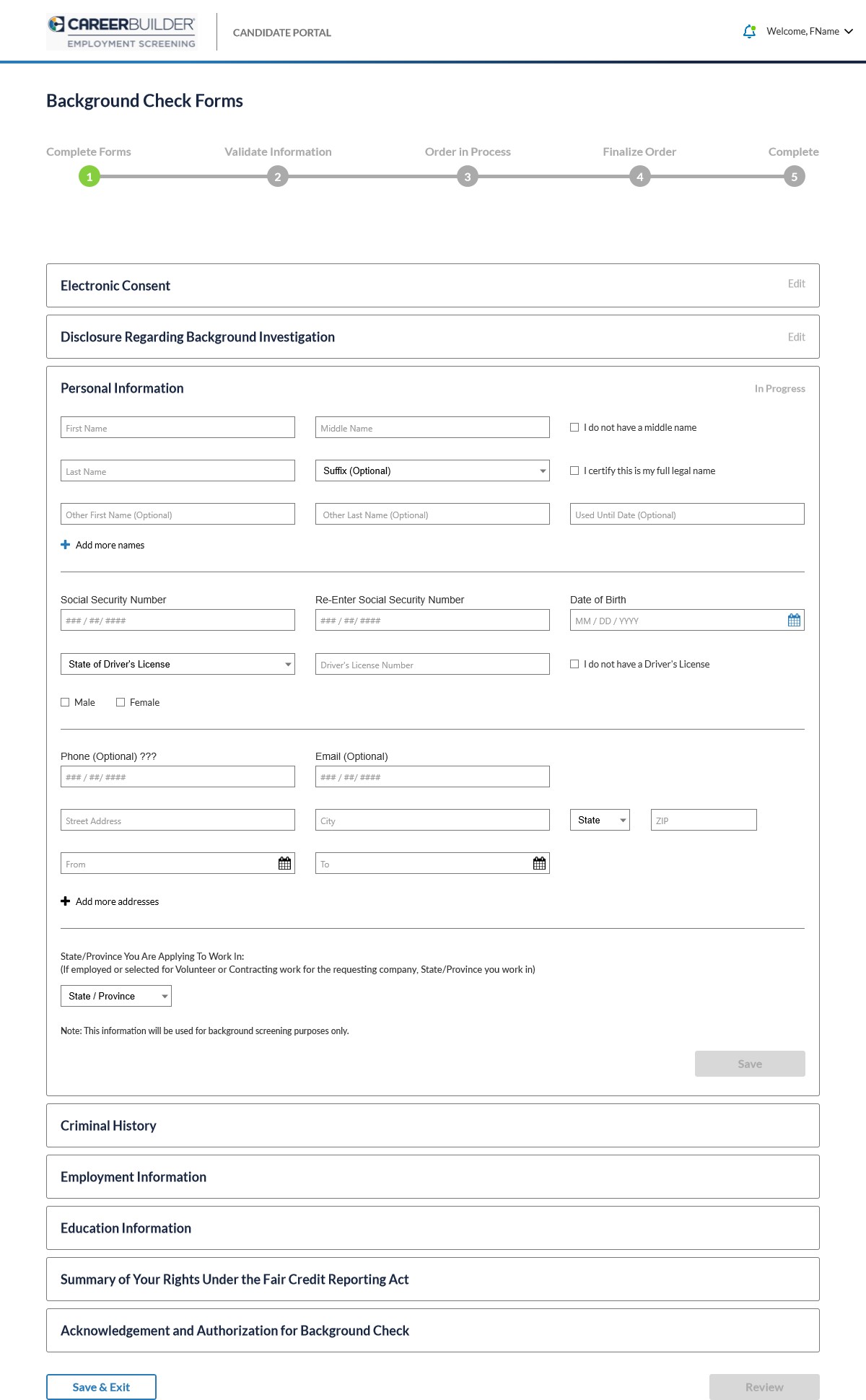
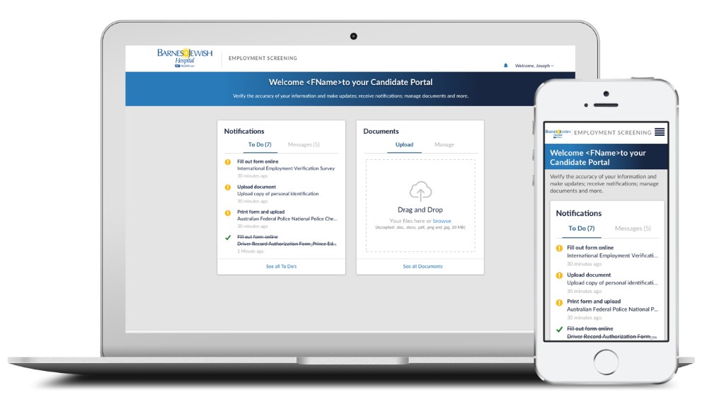
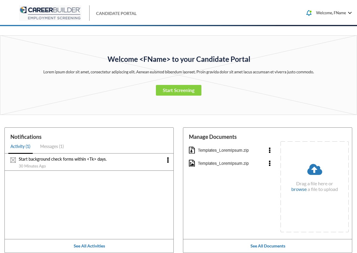
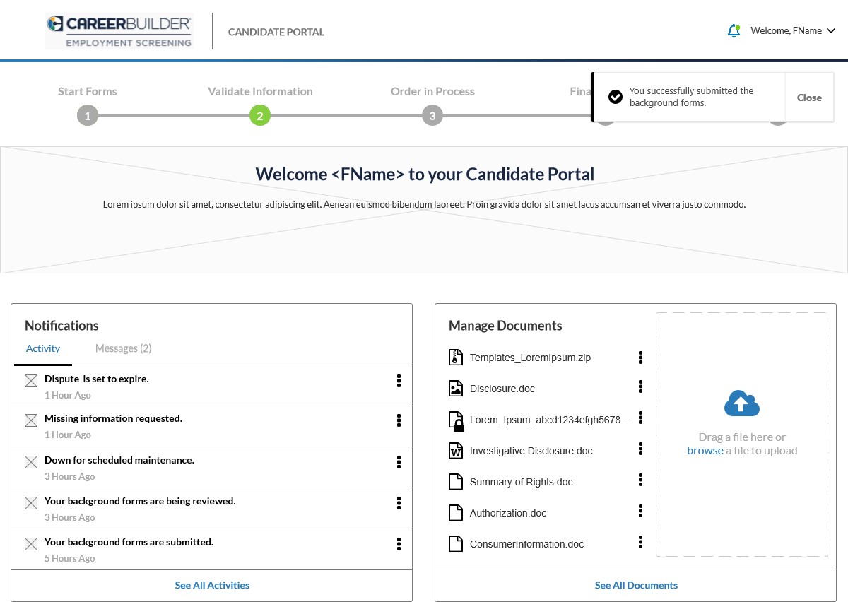
Additional feedback we heard from call center representatives and candidates was all the back-and-forth communication that occurred when requirements weren't met such as missing documents and signatures. So one of the new features we gave candidates was this hub where they could verify the accuracy of their information, make updates, receive notifications, manage documents and more.
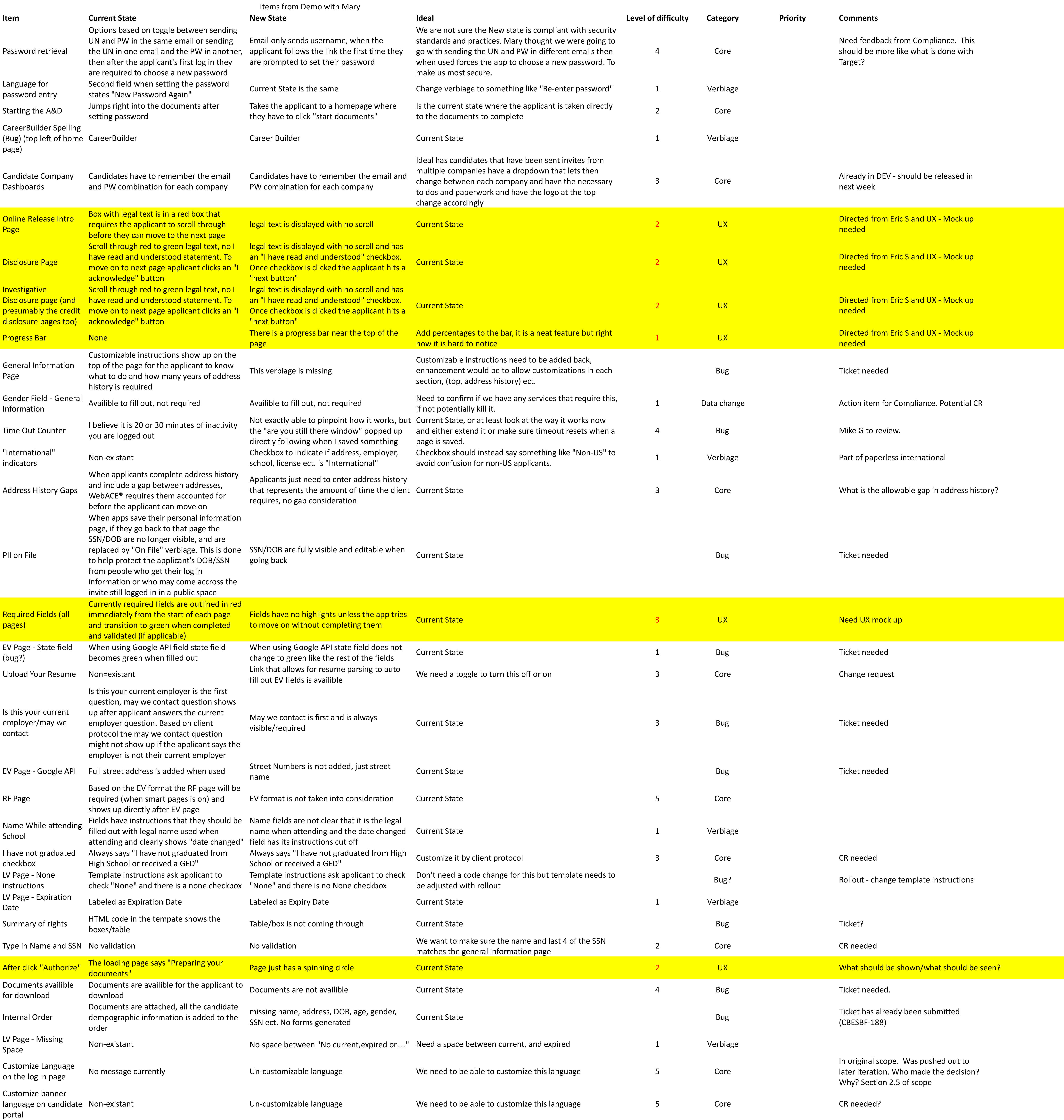
I reached out to a handful of internal employees to test the old screening form versus the new one for several categories including current state, new state, ideal state and level of difficulty. I don't want to take away the things that make sense in the existing UI and I'm listening for their feedback on my suggested improvements including the new date picker component.
Result
Senior leadership considered this project high profile and rushed the designs to development. With more than 50 screens to produce and a tight dealine to meet, I received help from nearly half of the UX team to create desktop and mobile views of the background check form and the hub.
